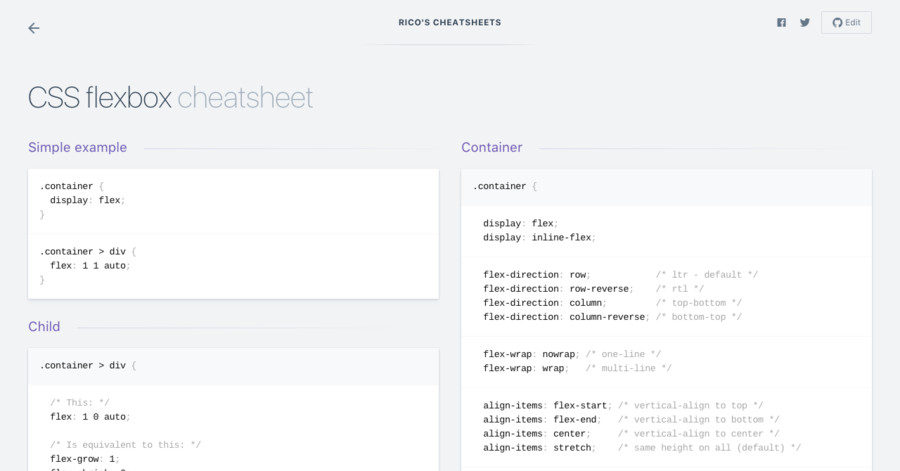
简单示例
.container {
  display: flex;
}
.container > div {
  flex: 1 1 auto;
}
容器
.container {
  display: flex;
  display: inline-flex;
  flex-direction: row;            /* ltr - default */
  flex-direction: row-reverse;    /* rtl */
  flex-direction: column;         /* top-bottom */
  flex-direction: column-reverse; /* bottom-top */
  flex-wrap: nowrap; /* one-line */
  flex-wrap: wrap;   /* multi-line */
  align-items: flex-start; /* vertical-align to top */
  align-items: flex-end;   /* vertical-align to bottom */
  align-items: center;     /* vertical-align to center */
  align-items: stretch;    /* same height on all (default) */
  justify-content: flex-start; /* horizontal alignment - default */
  justify-content: flex-end;
  justify-content: center;
}
子项目
.container > div {
  /* This: */
  flex: 1 0 auto;

  /* Is equivalent to this: */
  flex-grow: 1;
  flex-shrink: 0;
  flex-basis: auto;
order: 1;
  align-self: flex-start;  /* left */
  margin-left: auto;       /* right */
}
Tricks
垂直居中
.container {
  display: flex;
}

.container > div {
  width: 100px;
  height: 100px;
  margin: auto;
}
垂直居中(2)
.container {
  display: flex;
  align-items: center;     /* vertical */
  justify-content: center; /* horizontal */
}
Reordering
.container > .top {
 order: 1;
}

.container > .bottom {
 order: 2;
}
移动端布局
.container {
  display: flex;
  flex-direction: column;
}

.container > .top {
  flex: 0 0 100px;
}

.container > .content {
  flex: 1 0 auto;
}
A fixed-height top bar and a dynamic-height content area.
Table-like
.container {
  display: flex;
}

/* the 'px' values here are just suggested percentages */
.container > .checkbox { flex: 1 0 20px; }
.container > .subject  { flex: 1 0 400px; }
.container > .date     { flex: 1 0 120px; }
This creates columns that have different widths, but size accordingly according to the circumstances.
垂直
.container {
  align-items: center;
}
垂直居中所有项目
Left and right
.menu > .left  { align-self: flex-start; }
.menu > .right { align-self: flex-end; }